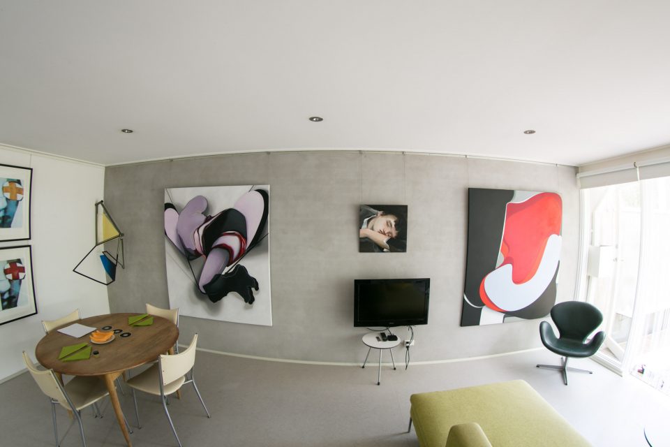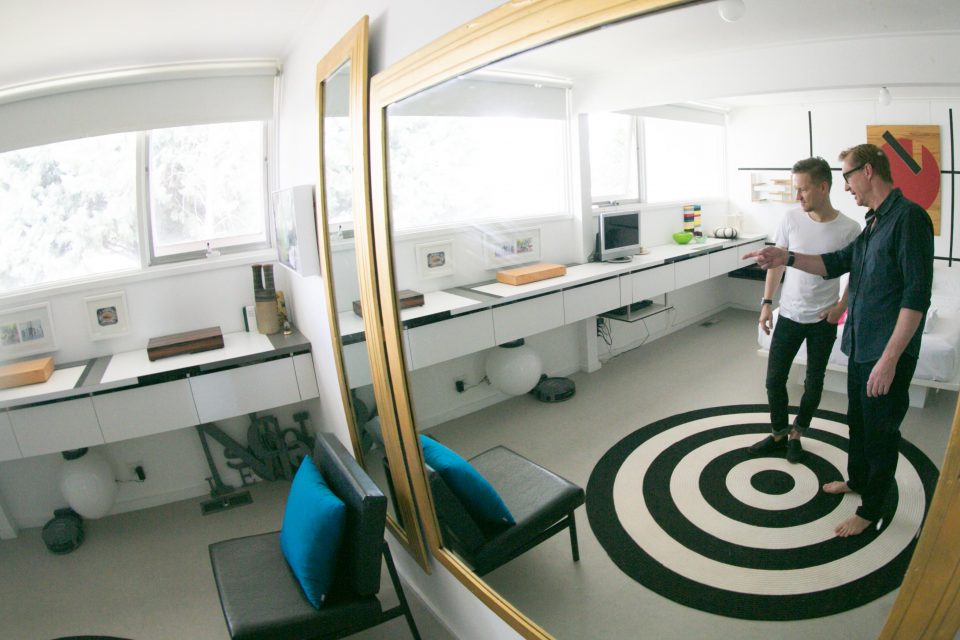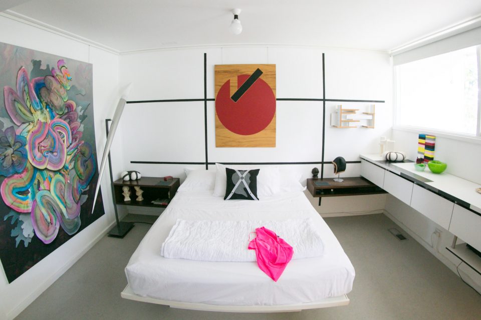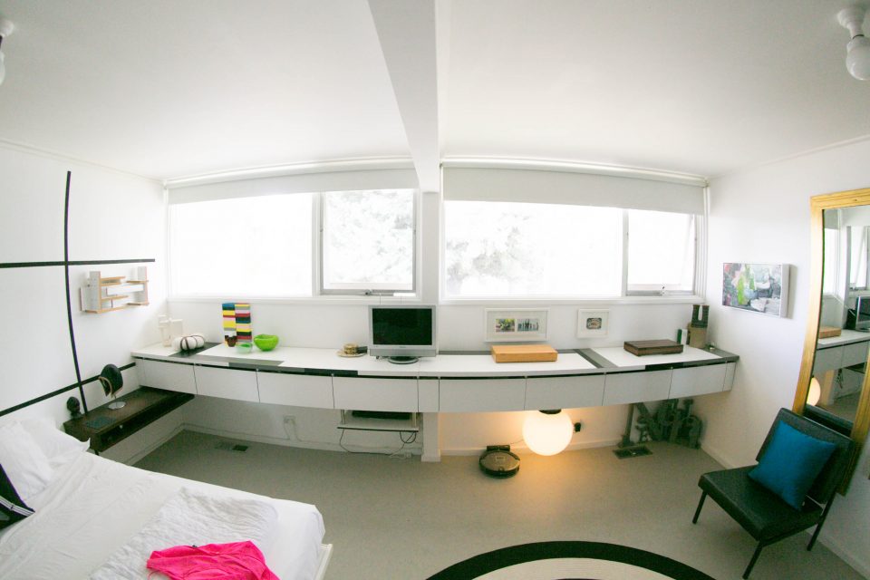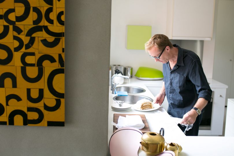
From the outside, Peter’s place looks like an almost typical Hughes ex-govie house, but then on second glance you notice there’s something else going on. And second glance is what I keep doing throughout my entire visit.
Over a tiramisu made with just the right amount of brandy, Peter explains how he and partner Marie bought the Tardis-like home in the 90s for a price that would make any current home buyer super jealous. They then took to removing some walls, painting over exposed red brick, knocking out door way arches and extending a backyard deck to create a sense of space.
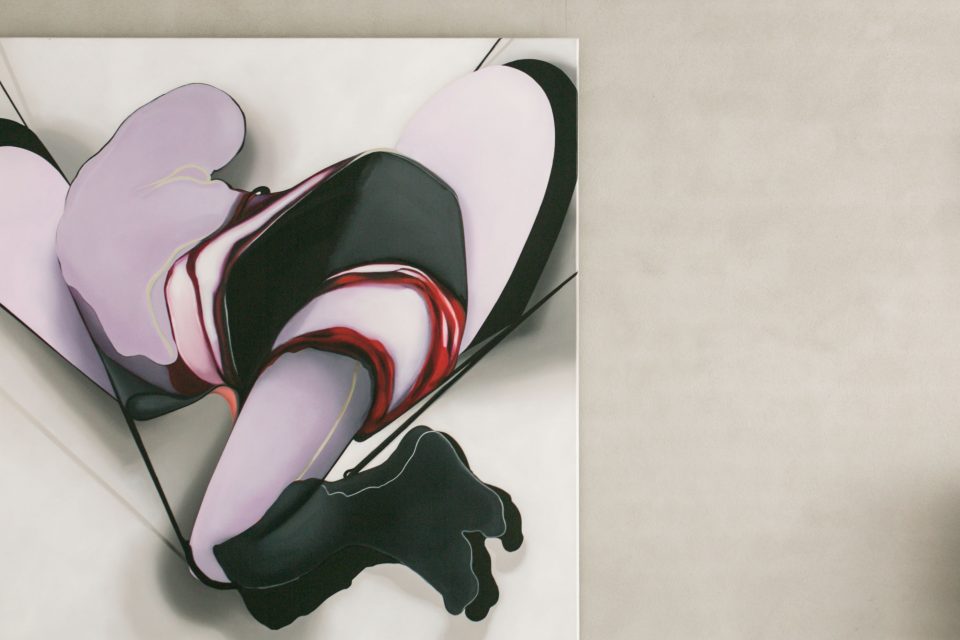
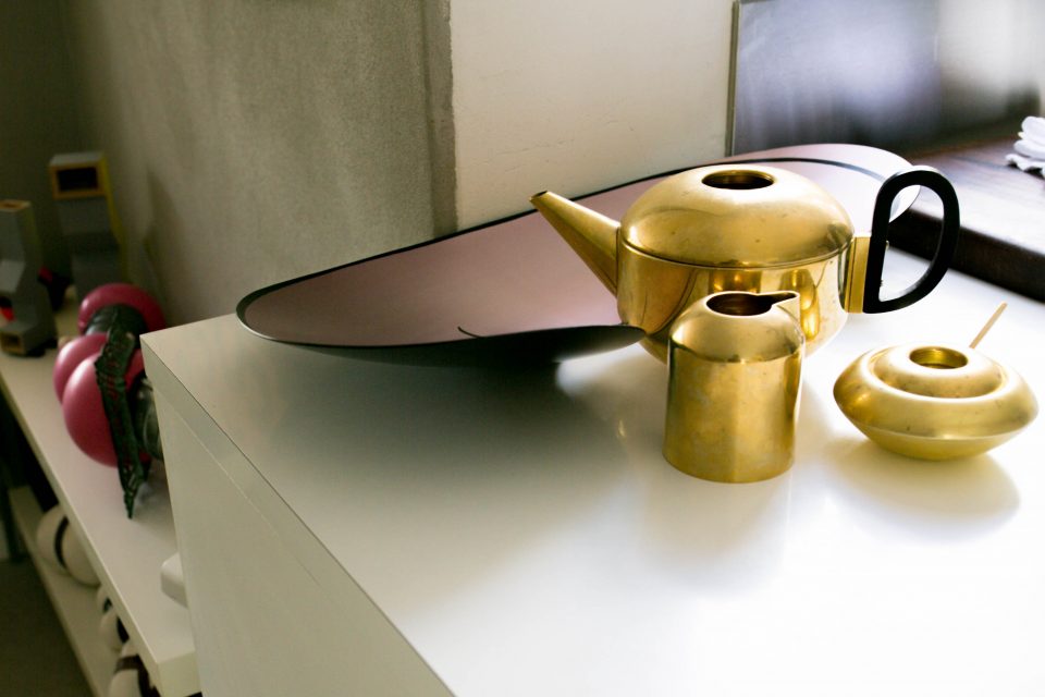
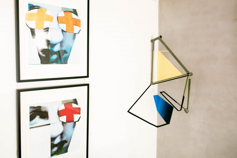
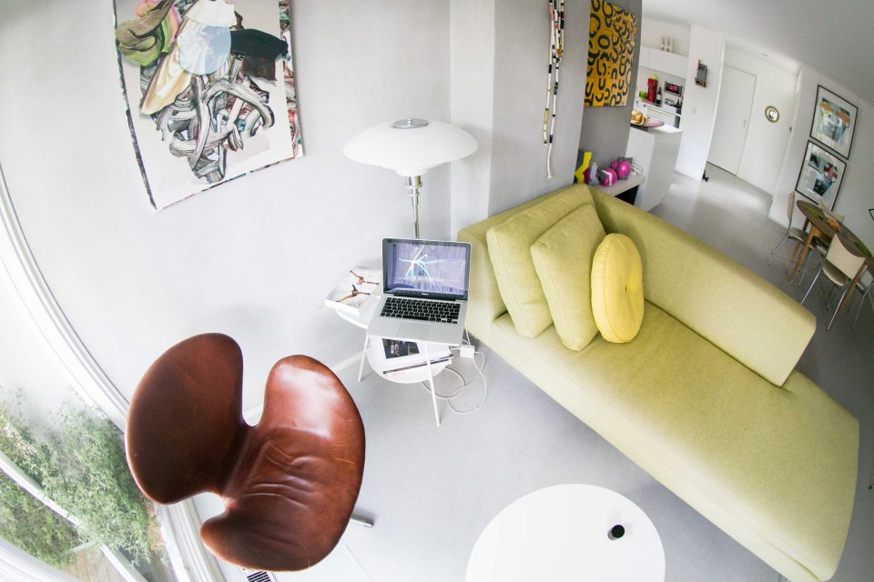
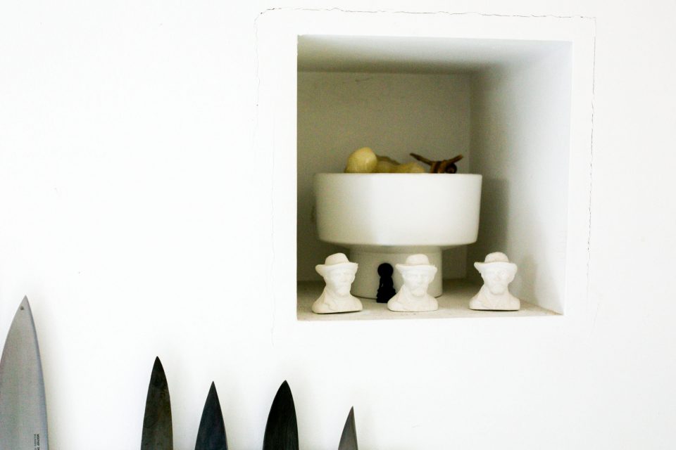
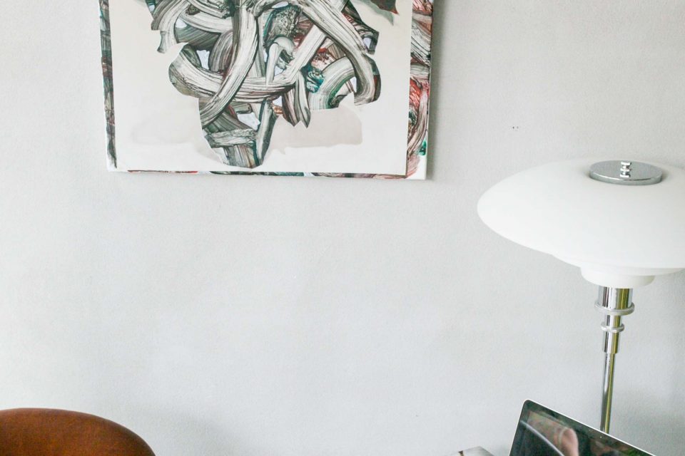
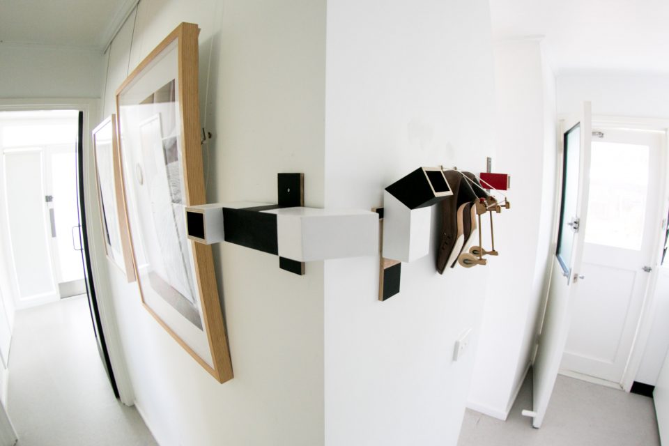
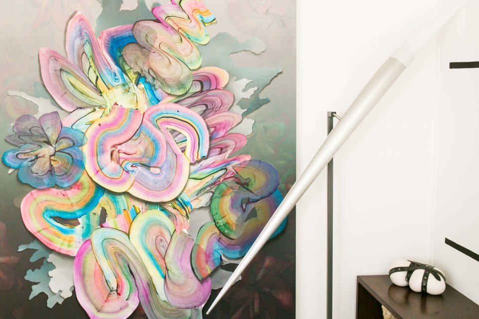
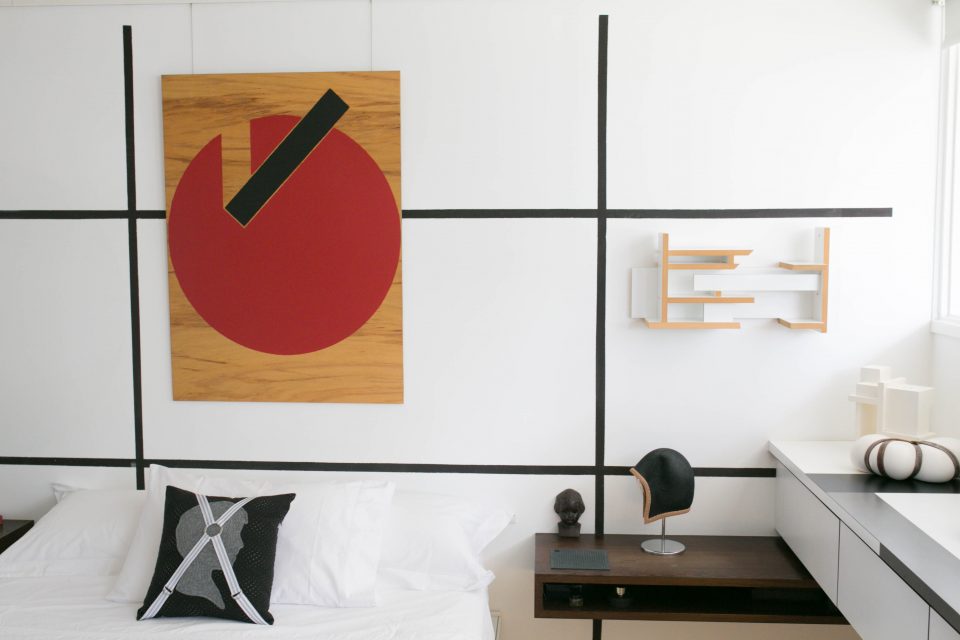
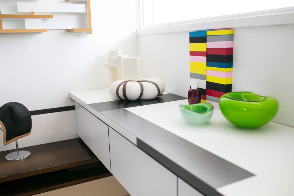
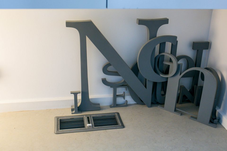
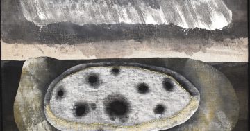
This place being much larger than the outside would make you believe; and apart from taking a second glance to see if there is any more cake, I can’t take my eyes away from all the art in their home, including their original works and works from other artists. Their home is like a gallery; open, airy and intensely interesting.
Now, here is the thing — places that have a lot of artistic objects mixed in with functional day to day objects can become very cluttered. It’s hard to pull off this look without looking like a hoarder who has broken into a local gallery.
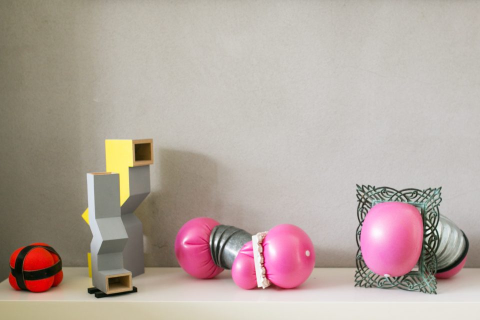
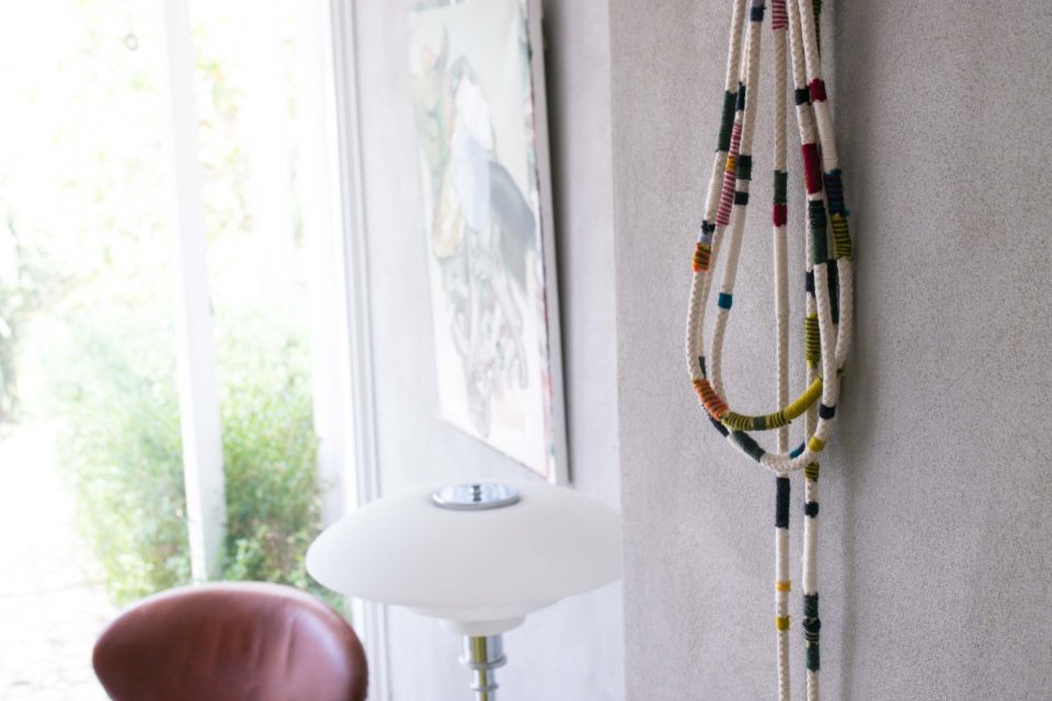
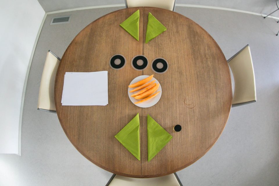
But two sets of artist’s eyes have resulted in a perfect balance of colour, interest, functionality and distinctiveness. Despite the works of art competing for your attention, the entire house is in no way overwhelming or overstimulating. It’s just clever aesthetic balance using colour, shapes and textures.
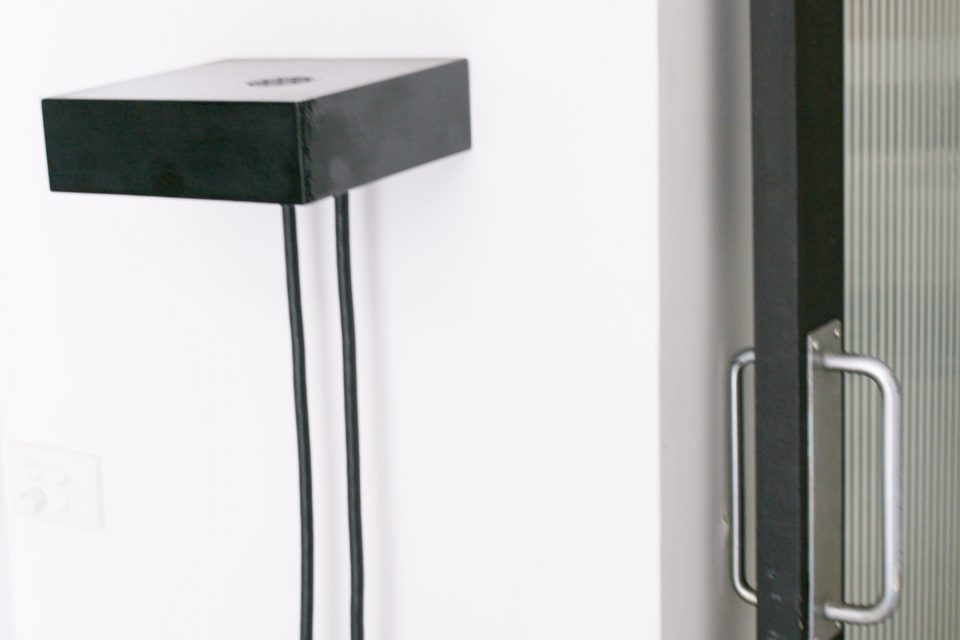
In response to most of the things I point at, asking ‘where did you buy that from’, Peter replies ‘I made it.’ The line becomes tedious after a while, so I eventually point at the cake. ‘No, I didn’t make that’. I knew I’d win eventually.
Words: Ashley Feraude
Pics: Victor Tawagi

